Hello readers!
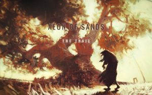
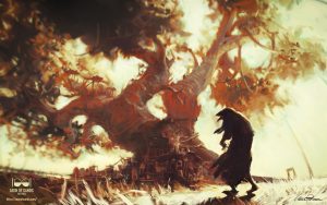
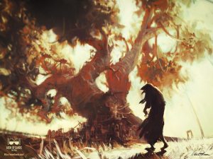
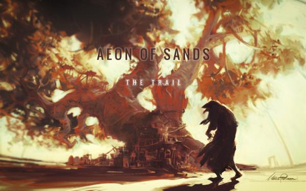
For this installment of “Sleep ’till late with Marco”, I’ll guide you in the process of Aeon of Sands – The Trail official videogame desktop wallpaper creation.
The first requirement to create artwork is someone who asks or forces you to do it. Usually a perverted creature called co-worker who ignores the fact that you already have something to do: to recover from too little sleep, to buy food and to defend yourself against garden vines that try to enter your floor uninvited. This kind of thing.
For proper illustration making, there are engagement rules to be respected.
Something along the lines of:
| Evil Co-worker: | We need a splash page. |
| Me: | We already have one, I call it “orange flat”. |
| Him: | No, I mean a proper one, with the Kinami tree… Have we already shown the tree? And the city… and the glass dome from the inside! And maybe tigers! A group of them attacking a pirate ship. In a stormy night! And the two Suns! |
| Me: | I see… Minimalism, Pop Art, the whole 20th century got nothing on you, right? |
| Him: | Don’t throw words at me! The only word is Code! |
| Me: | Right. Bye. [the communication breaks up. I go back to sleep.] |
 |
| Thumbnails ahoy |
After some other unjustified jokes associated with the threat that he would add heinous features to the game that only his distorted mind could love, like, more statistics, I give up, and for the sake of reason, I’ll make a few sketches that you see above.
What I wanted to create:
- a bold view of the sacred giant tree of the city of Pantella, called: Kinami
- the tree: important to the story of the game, thus should show its vitality, its will to spread, and to fill up the image
- the city: had to be shown growing on it, in a symbiotic relation
- a figure in foreground to help me state the proportion of the scene, and most of all to give a sense of story, of a final destination reached, or of something about to happen.
I thumbnailed a dozen possibilities, and decided for the one that seemed the most clear and sharply cut: a straightforward one.
 |
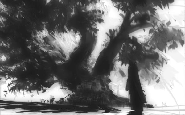
| Black and white rough |
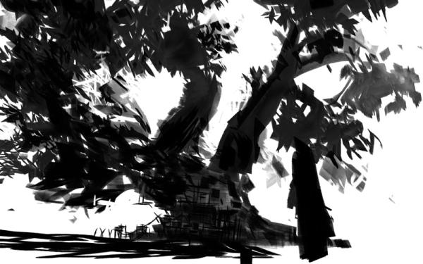
At that point, I usually want to have only a couple of values; in this case that was also seconding a scene overflown by the two suns’ light. I’m mostly concerned with shape and flow until very late in illustration, in any case.
After that, I distanced the various planes a bit, and thought about the mood.
In our story there is a kind of metaphorical veil, sometimes even a real one. A warm strangulation that threatens to suffocate the main character. This sometimes leads him in situations where right and wrong are blurred and Setrani, our leading actor, cannot help but miserably move on.
So, I started playing with that idea and the tree.
 |
| Add heat |
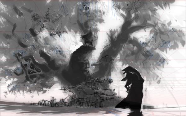
The rough was ready, and I started to work on the preparatory drawing. I don’t need such drawings to be very precise in respect to line, but I do need that in respect to masses; I need to know what goes where precisely.
I’m not the kind of visual artist that has the details fixed in mind from the start: I usually find them as I go on, as long as I have an expression, or emotion in mind, and a structure in place.
Now for instance, the placeholder figure in foreground was really lame. I needed a clear purpose for it, beyond the simple balance of the image.
So I borrowed a particular creature from the story, I covered it with a cloak, and gave it a sense of foreboding menace which fits with the general theme of the game.
 |
| Draw the skeleton out |
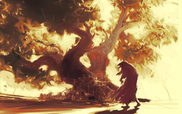
Then I started to paint it. A lot of clone-mix brush work and pencils later, I arrived the stage of the following screenshot.
 |
| Pour the color in |
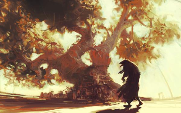
And even later, after adjusting the overall hue, adding detail and trying to pursue light diffraction and more distance separation, I came to the following one.
 |
| Add detail |
Then, I had to add the game title that also called for a revision of the logo used for the normal advertising screenshots.
 |
| Enter the logo |
I decided not to occupy myself so much with the dome, and to suggest it only in the distance. Besides, whatever the creature in the foreground is, the dome is an obstacle that didn’t stop it: it’s already inside the city limits. ,
Now I just had to add the shadows cast by the tree and by the figure on the ground, and add a bit of detail to it: grass, maybe a bit of farming for the sustenance of the city inhabitants.
Finally I placed the logo on it, and added the finishing touches.
That’s it!
If you like it, download it here in colossal [2560×1440] resolution for your desktop pleasure!
download wallpaper:
with Logo:
|
|
||||
|
|
without the Logo:
|
|
||||
|
|
Share it.
Tweet it.
Love it!
 |
Marco Pedrana, the more aerodynamic half of Two Bits Kid, artist, illustrator, narrator, designer, sleepwalker, I don’t actually have Setrani’ looks. |

