Latest News
Fonts: The Quest for Readability
Hello again!
We have now nearly 80% of the game finished and we are relieved to see more and more of the game content becoming safe from major revisions.
Today we tackle a bit of the remaining 20%, that includes checking that the presentation of the content is good enough not to distract you or prevent you from enjoying the game.
 |
| She might, but we are still polishing it. |
Take for instance the body of text of more than 80.000 words that accounts for the backbone of our game story.
You wouldn’t want to crawl through a novel badly formatted, with an unreadable font, no matter how interesting you find the story; in the same way, you wouldn’t want to click compulsively through AoS’ dialogue, pressing ‘Continue’ just to skip an eye tiring wall of text.
This kind of revision is something that is scary, yet, there’s an exhilarating freedom in savaging in a few hours what you spent weeks to carefully create: the old fonts, the text box, the dialogue paragraphs.
One thing was sure: the old font was not working for us, nor for the ladies and gents who tested the game at demo-events like Talk&Play or Gameover 2015.
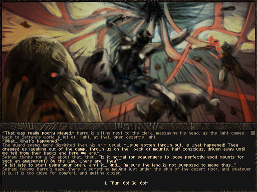 |
| Font nightmare |
That first font was born from the need to show blocks of text up to about 600 characters, in a fixed text display box of 505×118 px.
This basically means, leaving 1/3 of the box’s height for the dialogue choices, we still have 10 lines (an average of 90 uneven characters at 4×8 px size).
At first we thought that would be ok.
We wanted a crisp pixel look with no aliasing, and we still had no decisions for the resizing of the game screen, so the first thing I did was create a bitmap font of that 4×8 px size.
The results? Passably readable at fullscreen, on a 20 inches monitor. A pain at anything less or in windowed mode.
 |
| No, no, no, no, no, no… |
Back in April, I started to look around for a Creative Commons licensed font that was suitable for commercial projects and that was also good for us. We tested more than 20 promising candidates, ranging still in the 8 to 12 pixels height area.
Some were nice, actually really nice, but very few were actually readable, in discrete quantities.
Of the readable ones, instead, pretty much none captured the feeling of cheap thrills from sci-fi crumpled pulp magazines outta the fifties, that tints the Aeon of Sands world.
At last I decided to go and create one myself, using the great tool provided for free at Fontstruct. If you are an indie developer on a budget or you just love typography, you should take a look!
 |
| Monospaced or not? Bitmap or Truetype? 8 or 16 px? So many choices… |
As soon as I started drawing the font, it was apparent that anything below 12 px compromised the readibility of our story, while, on the other hand, only fonts of 8 or 16 px scaled well with our resolution changes in game, so I settled at a 16 px font.
After three iterations, plus a minor revision, the end result is Pantella, our very own font named after the city where the game starts, well readable both in windowed and fullscreen modes.
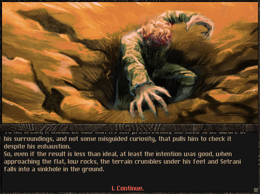 |
| Pantella. Or not a hole under our feet. |
How will it look in the new ‘cage’ of the user interface that we are implementing to meet the needs of the different monitors resolutions and ratios?
For that you’ll have to read the follow-up post of Florian in the next weeks!
Marco Pedrana, font-lover half of Two Bits Kid, artist. I want a vacation.
Aeon of Sands – watch our first recorded devlog #1
This was our first devlog livestream about our game Aeon of Sands – the trail. We are very happy that the audio and the stream went very well. It’s was a bit difficult to setup, because in Italy the internet connections are not that stable ;-), but OBS has a lot of options to finetune the stream. I do recommend this nice piece of software!
If you have still some questions about real time combat, character development, puzzles or story…feel free to send us question by twitter, google+ or facebook.
Live Game Session Sunday 05 June, 18:00 GMT on Youtube!
Hello!
We have a surprise announcement to make:
Live Aeon of Sands game session!
We will have a one hour live session on youtube live to play a couple of early levels of the game, and to answer your questions.
Please write us your questions in advance here in the blogpost’s comment or by twitter, google+ or facebook.
We will try to answer them all during the live stream!
You’re very welcome to join us and to spread the news to your friends!
Stay tuned,
Marco & Florian
Monthly Update: May
Hello, and welcome back for our monthly Aeon of Sands update!
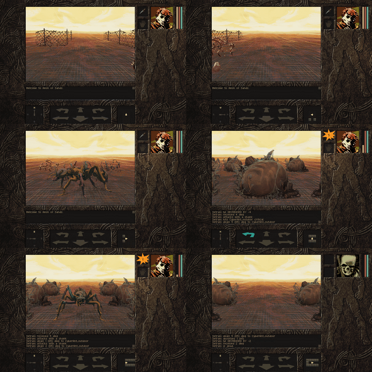 |
| They came from the des… Ahem, rust ants make short work of Setrani. |
What have we done the last weeks, you’re probably asking?
We worked mostly on 3 areas: opponents, text presentation, and a new dynamic light system.
In addition to that, a bit of work was done on the games mazes, that are due for a major playthrough next week, when all of us devs will convene for a 72 hours stress test.
This playthrough will mark the start of the last leg of development!
Opponents
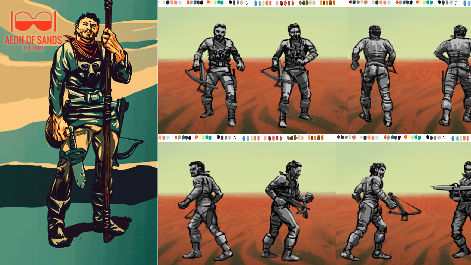 |
| A major NPC, Harro, from the concept to the greyscale animation. |
Take the example above: that’s Harro, a city guard, a soldier of the domed city where the game starts.
He was first imagined, character and purpose, as part of the game story in 2012; then his appearance designed the next year, you can see it in the left of the image, as his dialogues were written.
Last month he was finally greyscaled in animation, and these days he gets colored and completed.
The animation of the opponents is an ongoing task. The completion of the last ones will take us somewhere around the month of july. With that, all the graphic assets will be finally done!
There’s a feeling of exhilarating freedom about it: >90% of the graphics are there, the engine is ready, the A.I. gets finetuned every week, and new mechanics implemented.
Now we can finally construct more complex scenarios, stage more challenging fights and have fun adding puzzles that we talked about for months.
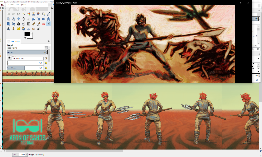 |
| From dialogue in-game illustration to finished animation! |
Here above is another one, Calca, a very peculiar nomad ravager: a crazy lady who effortlessly travels the desert by herself, whereas doing that in AoS is a certain death sentence.
She was first introduced in the game dialogues in january 2014, and became a favorite toy of the story, a character getting a life of her own into it, despite the writer’s original intention.
In the summer that year she got illustrated into the various scenes she appeared in, like the one in the upper part of the image above, and finally, last week, she got her complete animation in color, with her eyeglasses and bladed giant toothpick.
Text presentation
AoS leans on a large amount of dialogue’ text that structure its story. This means that we have to be extra thoughtful in how we present the text to the players. We cannot have walls of words hampering you from actual enjoying the games story.
To achieve this goal, we started to change the dialogue font. This process went through many iterations, into a much more readable one. We passed from a bitmap-font we created 2,5 years ago, to creative commons fonts, ranging from 8 to 16 px.
But really, none of these fonts were both easy to read and with a style that fit with the narration of the game world.
 |
| The original font, intended for fullscreen, turned out not really readable. |
In the end, we resorted to design our own truetype font, by the name of Pantella, our hero’ city; it had to support a consistent display of text, at a size of about 16 px; it was to be modern (AoS is not a fairy tales game), with tall lowercase, and kerning and spacing to tie the narration, while separating words.
We used Fontstruct by Fontshop for the task, that lets you design your own fonts and release them with a Creative Commons license, if you like to.
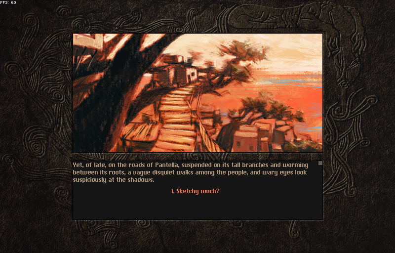 |
| The new font, aptly called Pantella. |
Then we turned to the text formatting.
This is a task that will bleed into polishing the game and will be complete only with the final revision of the game texts, scheduled for the summer.
Lighting System
As you may know, we use a Löve 2D as engine. Therefore lighting, even a fake lighting shader is a bit tricky. The problem: We have no real 3D engine and therefore we have no 3d model you can throw at the glsl lighting shader.
After some research, a friend of us had the amazing idea. We developed a deferred rendering approach with a precalculated depth pass. Here you see our very new lightning system in action.
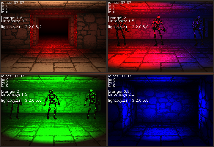 |
| GLSL lighting shader in action (this was only a test) |
Here is a small sample of an ambient moving lightsource (disabled Adblock or Ghostery to see this tweet).
I enhanced our dynamic lighting in @aeonofsands . It’s basically a special 2d deferred shading. #screenshotsaturday pic.twitter.com/djTDxXikJ3— Aeon of Sands (@aeonofsands) 14. Mai 2016
Monthly Update: April
Hello,
Marco here, writing from a wet corner of Italy, with spring just around the corner, strutting around like a whimsical young lady, promising she has places to go.
So I better keep this April update short, to go join her out for a bit!
Graphics
Last month saw me basically going on creating NPCs and monsters, as I anticipated in March post.
This is a task that, punctuated by some minor fixing of other assets’ graphics, or maybe creating acid spitting traps, or scribbling mysterious symbols on wall’ plaques, is taking more time than I thought.
But I’m getting there, as this nice guy, see below, testifies. Word of warning: it’s a sucker for love. Don’t let it get to close to show its affection!
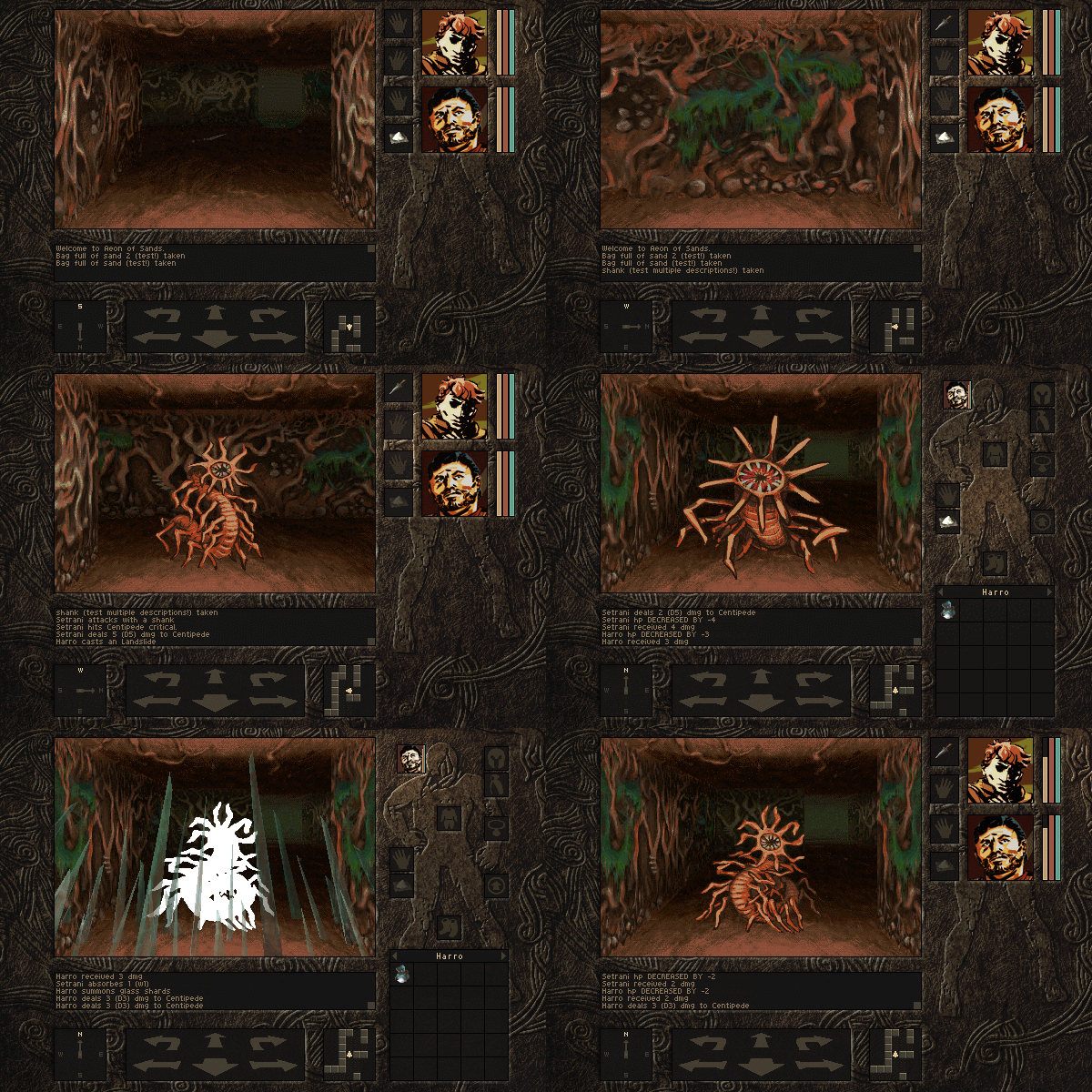 |
| A centipede, a bit of combat, and two spells in action |
Gameplay
Meanwhile in the not so cold Germany, the sun is shining too on Florian. This month he managed to advance his dungeon building task and to cram thousands of little features into the game: the stacking of inventory items like ammunitions, and the addition of a new particle system.
Therefore we have updated APE@Github, a particle Editor Tool originally created by mkdxdx for the LÖVE2D game engine. If you wanna play around with this little neat tool, just grab it here: ape_v3.love.
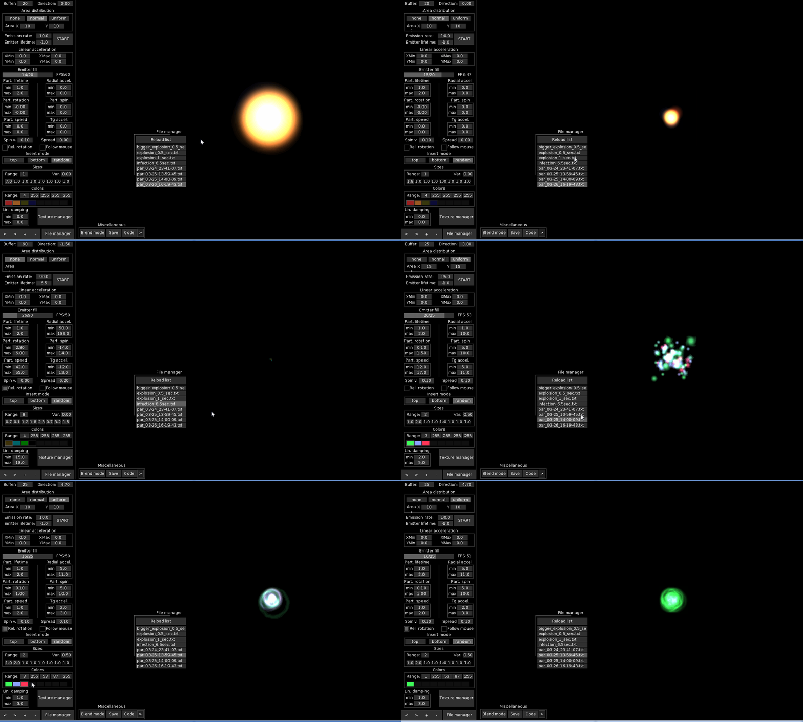 |
| Particle Editor in action |
That’s it for this month! We save video teaser and music talks for later, as our plans on them go forward on a separate track from the main game’s one,
I plan to complete most of the graphic assets for the whole game in may, maybe june at most. After that, for me, it will be only polishing, testing, and marketing!
 |
Marco Pedrana, slacker half of Two Bits Kid, artist, spring lover. I take naps. |
